HelioKit components — animated React + Tailwind UI
Copy-paste React + Tailwind components — animated, accessible, monochrome by default. Everything below is built from them.
Six to start with
Click a card to bring it forward, then click it again to open. Built with Card Stack 3D.

Hover to peek
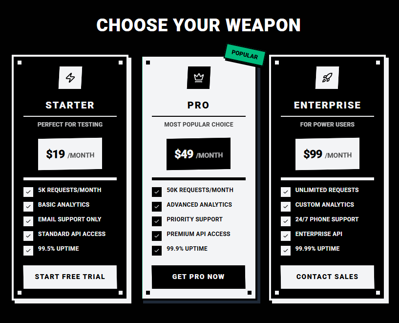
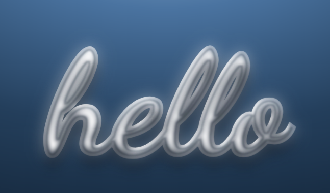
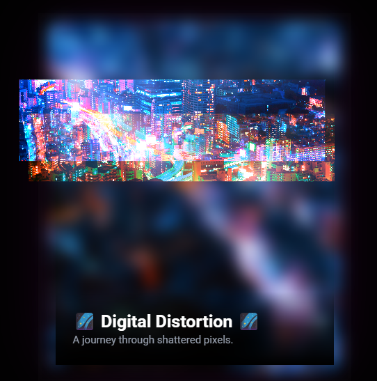
Component names scroll by — hover one to reveal its preview. Built with Image Reveal Marquee.
AccordionBox Flip TextBrutal PricingCalendarCard StackCard Stack 3DCrystal TextCustom ToastsFlip FormAccordionBox Flip TextBrutal PricingCalendarCard StackCard Stack 3DCrystal TextCustom ToastsFlip FormAccordionBox Flip TextBrutal PricingCalendarCard StackCard Stack 3DCrystal TextCustom ToastsFlip FormAccordionBox Flip TextBrutal PricingCalendarCard StackCard Stack 3DCrystal TextCustom ToastsFlip Form
Focus HighlightGlitch CardGlossy DockImage Reveal MarqueeLiquid PlasmaMeteor ShowerNebulla BackgroundPixel SpotlightProduct CardSocial GridText LoaderText ReflectionFocus HighlightGlitch CardGlossy DockImage Reveal MarqueeLiquid PlasmaMeteor ShowerNebulla BackgroundPixel SpotlightProduct CardSocial GridText LoaderText ReflectionFocus HighlightGlitch CardGlossy DockImage Reveal MarqueeLiquid PlasmaMeteor ShowerNebulla BackgroundPixel SpotlightProduct CardSocial GridText LoaderText ReflectionFocus HighlightGlitch CardGlossy DockImage Reveal MarqueeLiquid PlasmaMeteor ShowerNebulla BackgroundPixel SpotlightProduct CardSocial GridText LoaderText Reflection
Good to know
The list below is the Accordion component, restyled to the theme.
All components
Browse all 21.